Styling
Accounts in PayData can be created and updated using Account UI - a graphical user interface that enables end-users to interactively select an account type and specify required account settings and credentials.
This page explains the customization options for the Account UI.
Customizations
Account UI is a web application that can be customized using CSS color values and a URL to a header image.
To set CSS values use the change partner's own settings endpoint to
change properties inside uiSettings.styling:
PUT /partner/self

{
  ... other settings ...
  "uiSettings": {
    "styling": {
      ... styling settings ...
    }
  }
}
Fetch the current settings using the get partner's own settings endpoint first
to ensure existing values, like the partner name, are not overwritten when not specified.
Changes to the settings might not be reflected immediately in the Account UI as the values might be cached.
Table of properties
| Property | Type | Description |
|---|---|---|
headerColor | CSS color as string | Background color of header |
headerLogoUrl | URI | Absolute <img> src URI. |
bodyColor | CSS color as string | Background color of <body> element |
textColor | CSS color as string | Text color of <body> element |
accordionFocusedOutlineColor | CSS color as string | Color of accordion's outline on focus |
accordionExpandedColor | CSS color as string | Background color of accordion when expanded |
accordionExpandedTextColor | CSS color as string | Text color of accordion when expanded |
accordionCollapsedBgColor | CSS color as string | Background color of accordion when collapsed |
accordionCollapsedTextColor | CSS color as string | Text color of accordion when collapsed |
accordionBodyColor | CSS color as string | Background color of accordion's expanded body |
backButtonBorderColor | CSS color as string | Border color of back button |
backButtonBgColor | CSS color as string | Background color of back button |
backButtonTextColor | CSS color as string | Text color of back button |
cancelButtonBorderColor | CSS color as string | Border color of cancel button |
cancelButtonBgColor | CSS color as string | Background color of cancel button |
cancelButtonTextColor | CSS color as string | Text color of cancel button |
nextButtonBorderColor | CSS color as string | Border color of next button |
nextButtonBgColor | CSS color as string | Background color of next button |
nextButtonTextColor | CSS color as string | Text color of next button |
nextDisabledButtonBorderColor | CSS color as string | Border color of disabled next button |
nextDisabledButtonBgColor | CSS color as string | Background color of disabled next button |
nextDisabledButtonTextColor | CSS color as string | Text color of disabled next button |
When you set a value for a property, the value is applied to the Account UI. If you set a value to null, the default value is used.
Examples
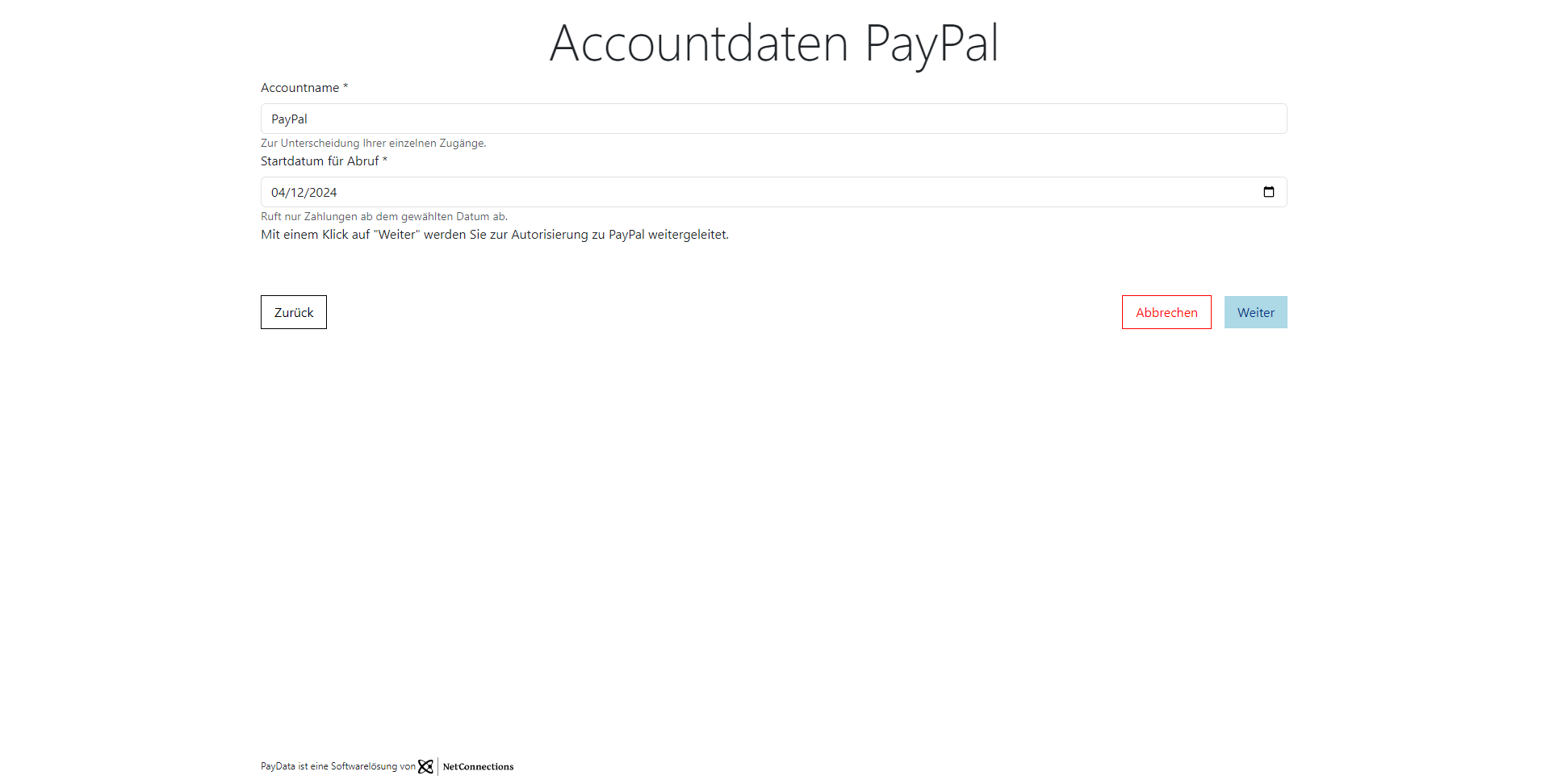
Change header image
To change the header image, set the headerLogoUrl property to a URL that points to the image.
Use absolute path
Set the headerLogoUrl property to an absolute URL that points to the image:
{
  ... other settings ...
  "uiSettings": {
    "styling": {
      ... other styling settings ...
      "headerLogoUrl": "https://api.paydata-api.com/partner-ui/v1/images/netconnections_schwarz_klein.png"
    }
  }
}
| Before | After |
|---|---|
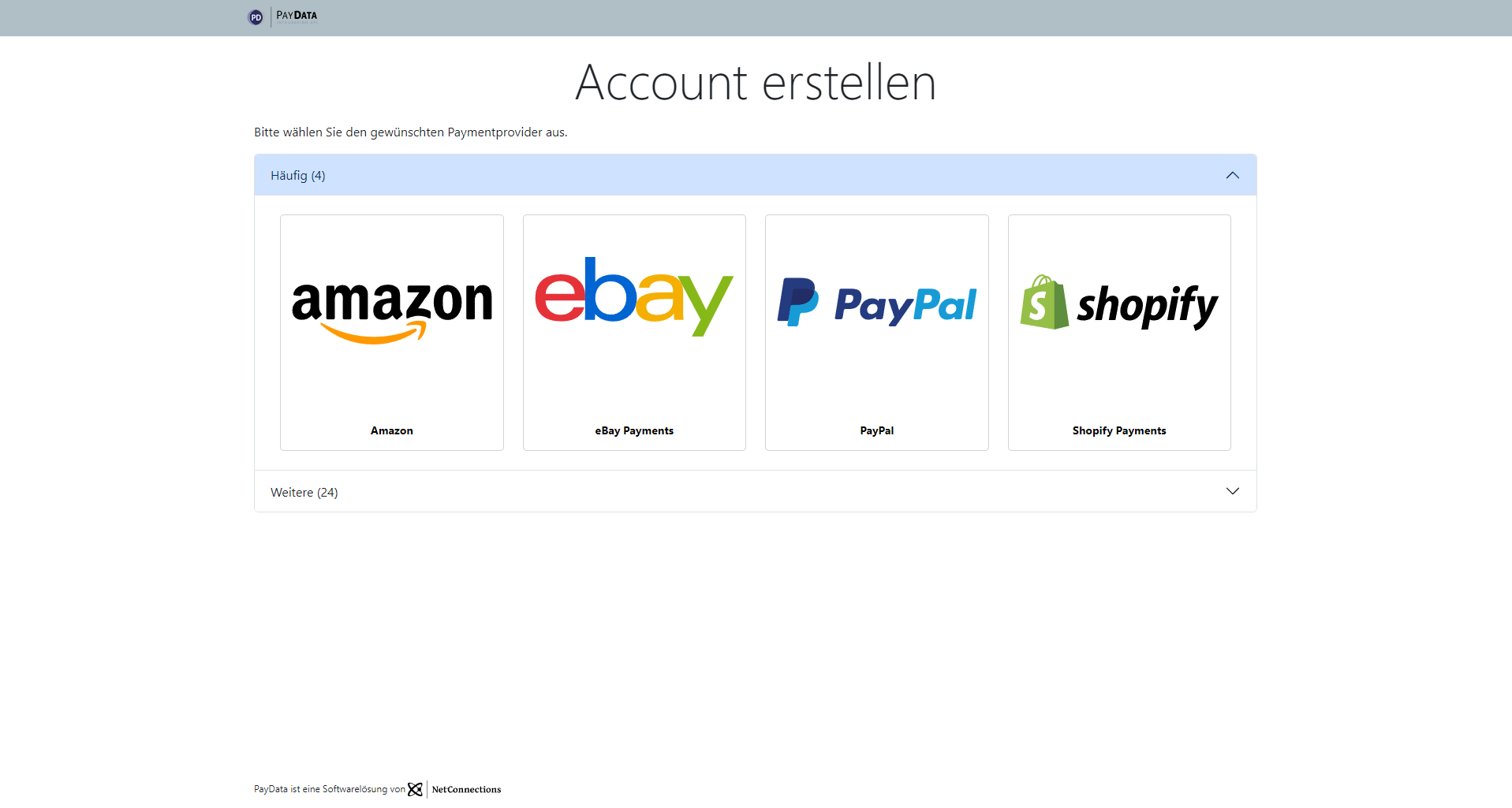 | 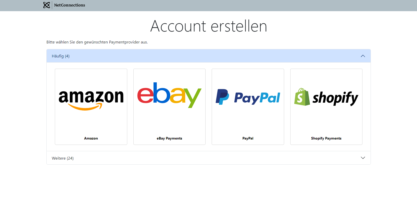 |
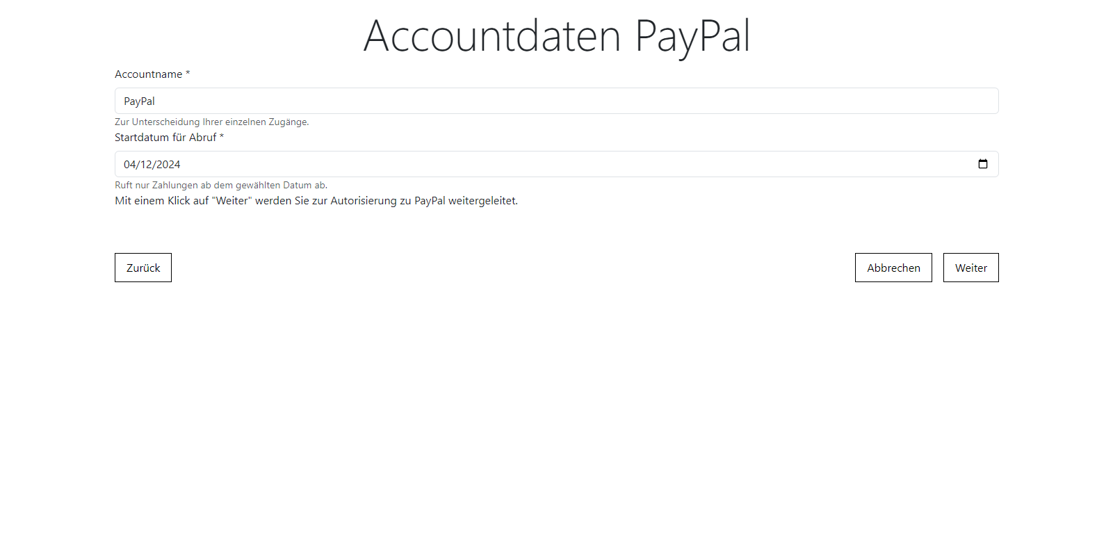
Change colors
Use CSS named colors
Set the background color of the header to crimson red:
{
  ... other settings ...
  "uiSettings": {
    "styling": {
      ... other styling settings ...
      "headerColor": "crimson"
    }
  }
}
| Before | After |
|---|---|
| 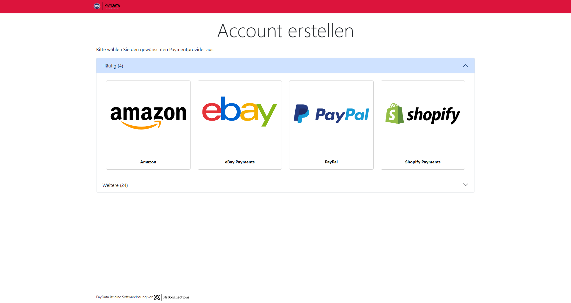 |
Use CSS hex colors
Set the background color of the next button to a light blue and the text color to a darker blue:
{
  ... other settings ...
  "uiSettings": {
    "styling": {
      ... other styling settings ...
      "nextButtonBgColor": "#add8e6",
      "nextButtonTextColor": "#003087"
    }
  }
}
| Before | After |
|---|---|
 |  |
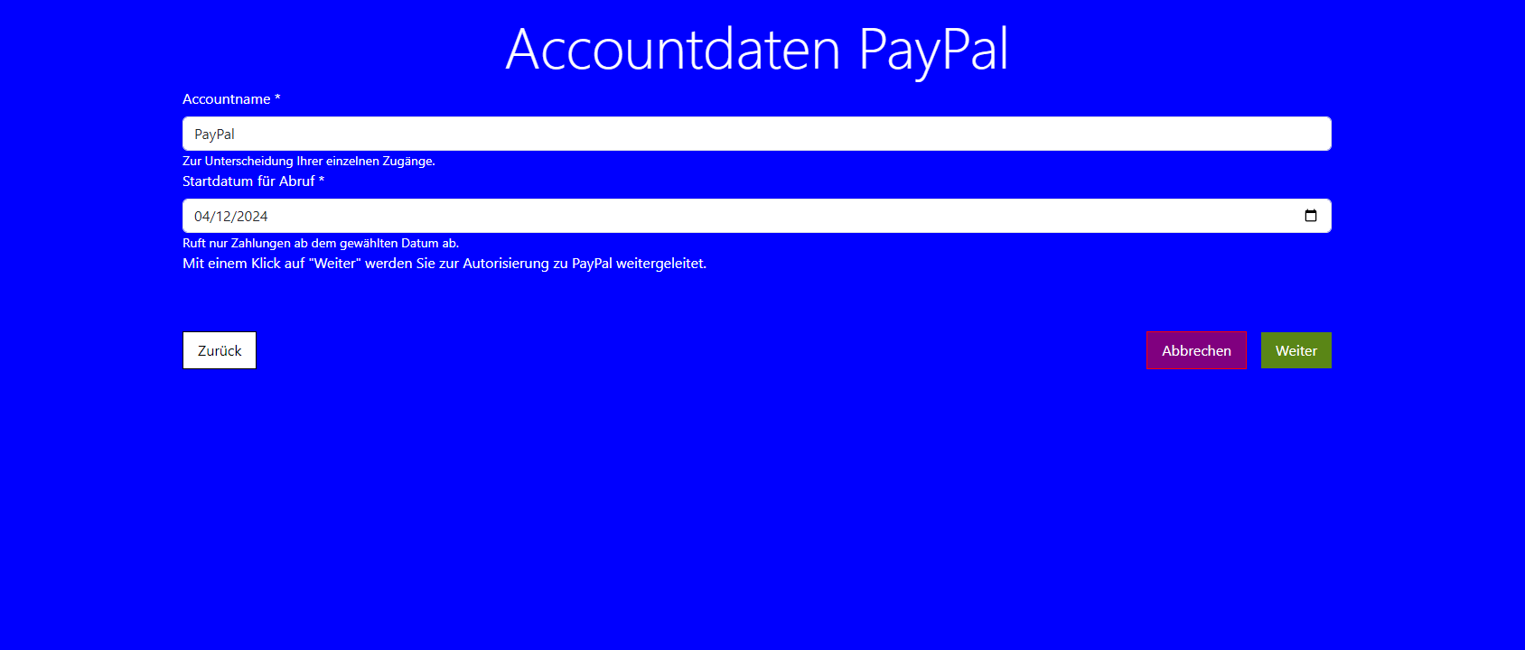
Use CSS rgb values
Set all three buttons to a black-white theme:
{
  ... other settings ...
  "uiSettings": {
    "styling": {
      ... other styling settings ...
      "backButtonBorderColor": "rgb(0, 0, 0)",
      "backButtonBgColor": "rgb(255, 255, 255)",
      "backButtonTextColor": "rgb(0, 0, 0)",
      "cancelButtonBorderColor": "rgb(0, 0, 0)",
      "cancelButtonBgColor": "rgb(255, 255, 255)",
      "cancelButtonTextColor": "rgb(0, 0, 0)",
      "nextButtonBorderColor": "rgb(0, 0, 0)",
      "nextButtonBgColor": "rgb(255, 255, 255)",
      "nextButtonTextColor": "rgb(0, 0, 0)",
      "nextDisabledButtonBorderColor": "rgb(0, 0, 0)",
      "nextDisabledButtonBgColor": "rgb(0, 0, 0)",
      "nextDisabledButtonTextColor": "rgb(255, 255, 255)"
    }
  }
}
| Before | After |
|---|---|
|  |
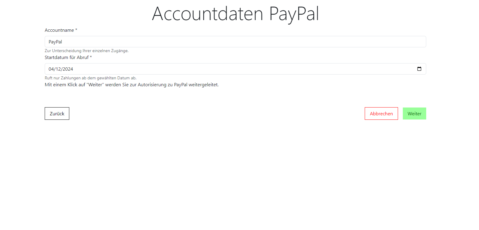
Use rgba values
CSS rgba values have a fourth value that defines the alpha channel. The alpha channel is used to define the transparency of a color. A value of 0 means fully transparent, while a value of 1 means fully opaque. For example, rgba(0, 0, 0, 0.5) is half transparent and rgba(0, 0, 0, 1) is fully opaque.
Mix a blue background color with a red transparent abort button to create purple:
{
  ... other settings ...
  "uiSettings": {
    "styling": {
      ... other styling settings ...
      "bodyColor": "blue",
      "textColor": "white",
      "cancelButtonBgColor": "rgba(255, 0, 0, 0.5)",
      "cancelButtonTextColor": "rgb(255 255 255)"
    }
  }
}
| Before | After |
|---|---|
|  |
Use CSS hsl values
Set the background color of the next button to a light green and the text color to a darker green:
{
  ... other settings ...
  "uiSettings": {
    "styling": {
      ... other styling settings ...
      "nextButtonBgColor": "hsl(120, 100%, 80%)",
      "nextButtonTextColor": "hsl(120, 100%, 20%)"
    }
  }
}
| Before | After |
|---|---|
|  |
Reset to defaults
Setting a property to null sets the property to the default value. Missing properties will also be reset to default.
To easily reset all customizations back to the default values, set stylingSettings to an empty object ({ }):
{
  ... other settings ...
  "uiSettings": {
    "styling": {}
  }
}